How to Choose a Cohesive Color Palette for Your Event Styling

Recent Trends
Event styling blogs and industry portfolios increasingly highlight color palettes that move beyond seasonal clichés. In recent months, several broad directions have gained traction:
- Earthy neutrals – warm taupes, terracotta, olive greens, and sand tones dominate intimate gatherings and outdoor ceremonies, offering a natural backdrop that works across multiple lighting conditions.
- Jewel-toned accents – deep emerald, sapphire, and amethyst are layered over neutral bases for gala dinners and formal corporate events, lending a sense of richness without overwhelming the space.
- Monochromatic schemes – single-hue variations (e.g., blush to burgundy) simplify coordination and produce highly photogenic, editorial-style results, especially for social-media-minded hosts.
- Digital-first palettes – designers now test palettes using virtual mood boards and color-picking tools before committing to physical materials, reducing last-minute mismatches.
Background
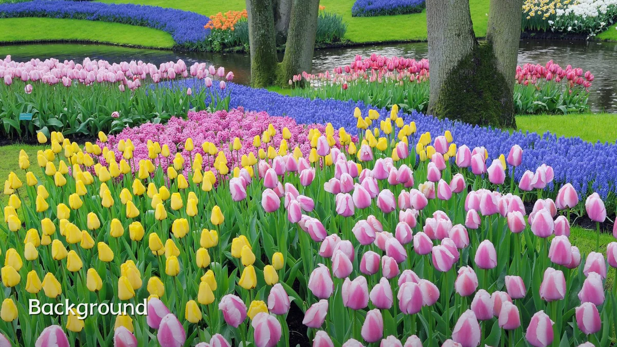
Color cohesion has long been a cornerstone of event styling because it directly influences perceived professionalism, mood, and visual flow. Basic color theory—complementary, analogous, and triadic relationships—provides a foundation, but practical constraints such as venue tones, fabric availability, and lighting often override textbook rules. The goal is a palette that feels intentional rather than accidental, guiding guests’ eyes naturally from entrance to focal points.
User Concerns
Those planning events—whether seasoned stylists or first-time hosts—frequently encounter the same friction points when selecting a palette:
- Overchoice paralysis – thousands of possible hex codes and paint swatches can stall decision-making, especially when multiple stakeholders (clients, vendors, family members) each have preferences.
- Clashing with fixed elements – existing venue floor tiles, wall colors, or carpet patterns may resist the intended palette, requiring compromises that dilute cohesion.
- Budget vs. impact – achieving a true cohesive look often demands custom linens, dyed flowers, or painted props, which may stretch a moderate budget.
- Lighting distortion – a palette that appears harmonious on a screen can shift under incandescent, LED, or natural daylight, leading to unexpected color clashes in photographs.
- Guest experience trade-offs – overly trendy palettes (e.g., high-contrast neons) may photograph well but fatigue guests over a long event, while overly safe palettes risk feeling generic.
Likely Impact
The choice of a cohesive palette ripples beyond aesthetics. In photography, a well-constrained palette reduces post-processing work and ensures that skin tones remain balanced. For corporate events, a consistent color story reinforces brand identity and can improve attendee recall of key messaging. Social sharing also benefits: monochromatic or tight-complementary palettes tend to yield higher engagement on visual platforms because they appear “designed” rather than random. Conversely, a disjointed palette can undermine even a carefully planned event, making the space feel cluttered or under-prepared.
What to Watch Next
Several developments may shape how palette choices are made in the coming seasons:
- AI-assisted palette generators – tools that analyze venue photos, lighting conditions, and guest attire expectations will likely become standard in styling workflows, reducing trial-and-error.
- Sustainable color sourcing – as eco-consciousness grows, palettes are increasingly constrained by what can be sourced locally or from natural dyes, nudging designers toward regional, seasonal hues.
- Cross-medium consistency – expectations now extend beyond flowers and linens to digital invitations, signage, projection mapping, and even food presentation, requiring palettes that translate seamlessly across physical and digital surfaces.
- Return of personal storytelling – some stylists are moving away from trend-driven palettes toward color schemes drawn from a host’s personal memories (e.g., a favorite travel photo or heirloom textile), making cohesion feel authentic rather than formulaic.